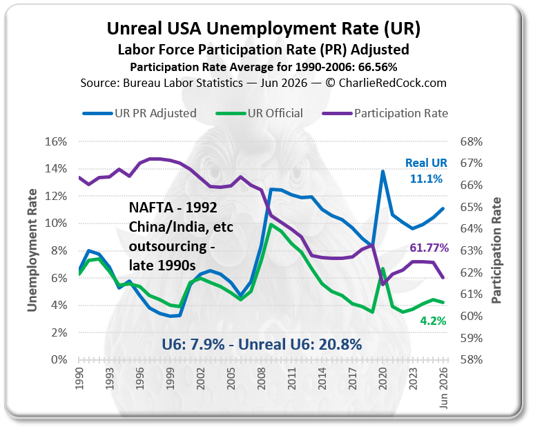
Unreal USA Unemployment
The U.S. Unemployment Rate, as published by the Bureau of Labor Statistics, is a charming little number that politely ignores the labor force participation rate—because who wants historical context when you can have selective optimism? To get the real story, you have to rewind to the pre-housing-crisis era, back when jobs were plentiful and avocado toast hadn’t yet been blamed for everything. The difference between the published rate and the real rate? That’s just the sound of people quietly exiting stage left from the labor force. And when they come back? Voilà—economic recovery!
Now, if you really want the juicy stuff, look at the REAL U‑6 Unemployment Rate. It’s the nosy neighbor of statistics: it counts not just the unemployed, but also the “maybe-I’ll-work-again” crowd and the “I’m working part-time but dreaming of full-time” folks. Basically, it’s the stat that says, “Let’s be honest.”
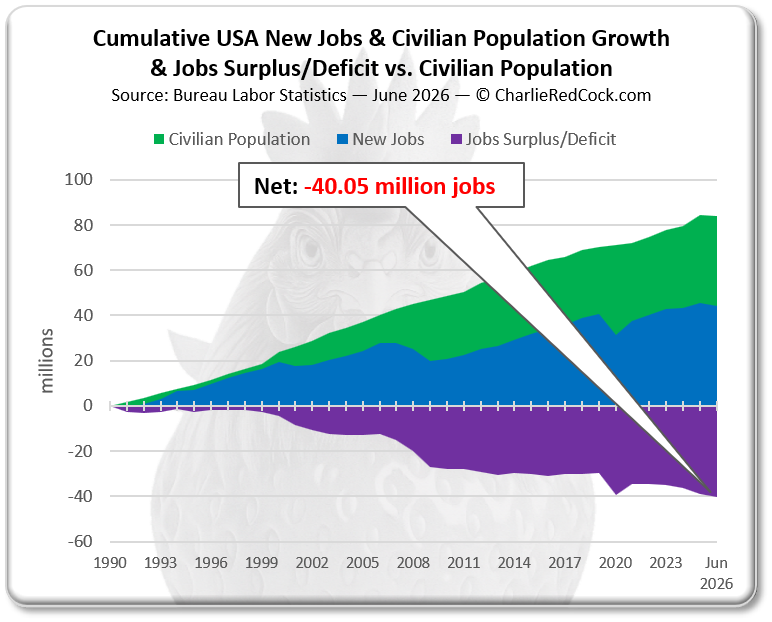
Monthly jobs reports? Oh, those are usually served à la carte—tiny portions with no sides. They focus on new jobs without asking, “Hey, did the population grow too?” This chart, however, brings the full buffet: annual and cumulative job creation, population growth, and whether we’re running a job surplus or deficit. Spoiler alert: sometimes we’re feeding more mouths with fewer paychecks.
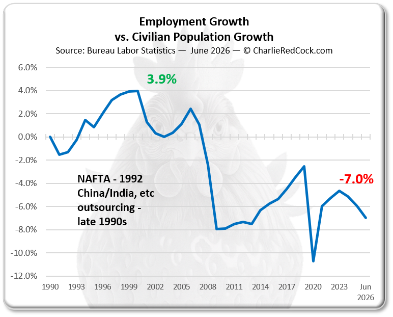
Employment Growth vs. Civilian Population Growth balances at 0%, which is economist-speak for “we’re not drowning, but we’re not exactly swimming either.” A positive number means the job market is tight—like your jeans after Thanksgiving. A negative number? That’s when we start patching the holes with credit cards and government IOUs, borrowed against future tax revenue. Because nothing says “fiscal responsibility” like a promissory note to your unborn grandchildren.
Here are the gorgeously data in chart professional format compliant with academic standards that are the envy of nobody.